Sunday, 28 February 2016

Paper-Cutting

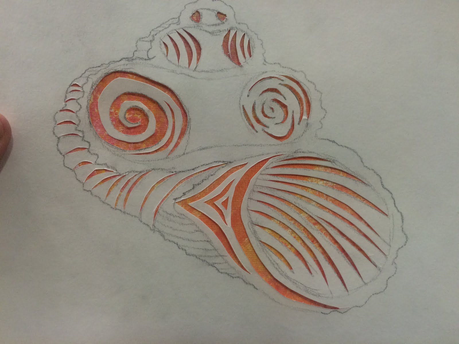
I drew a shell and decided to show the shape of the shell by cutting out different patterns within the shell to give it texture and to see the different layers of the shell.


I started by cutting patterns into the areas where the shell was hollow, trying to keep it quite compact to represent the shadow within the hollow area.


I found that some knifes were sharper than others and I personally found it easier to cut the curvier lines with a blunter knife as it didn't cut the cartridge paper as easily so it was more controllable.


I then started to cut lines where the texture in the shell was, to try and give it more of a 3D effect with shadowing and texture.


Here, is a photograph of the paper-cut out with the ceiling light shining through. I feel as though this didn't work very well as the light only shines through a small area of the paper-cut out as the light is too small so it doesn't have much of an effect. I also feel like even if the light shone through the entire paper-cut it would not have worked anyway as you can see in the small area where the light does shine through that the light blurs in the camera and actually covers up the paper so that you can't see the detail of the cut-out.


Here I tried to place the cut-out on different backgrounds to see what effects it would have on the paper-cut out. In the two photographs above, I used a digital background which was a blue-space scene and I think it gave the cut-out of the shell a watery effect to give the impression that it is floating on/ or in water.

In the photograph below, I placed the shell paper-cut out on top of my big final work piece from the three that I did as the background was done in the colours of shells and I think that it works well the the paper-cut as you see the background shine through with the cut out areas showing revealing the colours of the shells. I feel that for the textured area on the right I need to cut more paper away to reveal more colour and have the white paper act as the shadow area, as well as finishing it to add more shape and texture to the shell. I feel that it worked best with the painted background behind it rather than light and digital screen as it made it seem more naturalistic.

Sunday, 21 February 2016

Refinement

Before
After


I wasn't happy with this painting because I didn't think that there were enough colours in the hands and I also felt like I needed to add more colour in the shadow and background to continue the style of the rest of the painting. I also felt like I needed to continue some of the darker colours in the shells onto the hands to create a shadow effect and make them seem more 3D and actually in the hands rather than just placed on top of them.
 

Thursday, 11 February 2016

Exhibition and Critique of My 3 Final Pieces


Before
After


The two larger paintings link clearly with the theme of shells with the smallest piece being quite unclear other than the obvious crystal texture, however all three of the paintings link with the use of bright colours. I feel like the chalk shells in the biggest piece are drowned out by the vivid colours in the background and are quite transparent because of the medium, perhaps they would stand out more with some subtle white paint strokes. The placement of the pieces seems to work well to bring your attention to each piece with the focus being on the biggest piece in the centre. The placement of the small piece on top also works well as you can see the light reflecting of the salt crystals which makes them more obvious and makes the texture of the piece more visible to the person looking at it. I feel that the bottom piece works well placed there as it allows the person viewing it to see the layers of different colours in the hands and shells.

The smaller piece was produced in a similar style to the artist Karen Hansen, with the colours focusing on those in crystals and the salt crystals on the painting to create the texture and theme of crystals for the piece. The biggest piece was also produced in a similar style to the artist Karen Hansen with the focus being on the colours in the shells, to re-enhance the theme of shells there is a subtle chalk drawing of some shells with the background acting as their colour and texture. The bottom piece was drawn from a photograph and painted in the style of the artist Linzi Lynn with the use of bright and unusual colours, the colours were used to create texture, tone and shadowing in the painting so that it was obvious that it was a pair of hands holding some shells. The background consists of varying tones of a sandy-gold colour so that the attention is not drawn away from the object itself.

I feel like the placement under the light works well to an extent, however I feel that more natural lighting from the sun would help to bring out the colours in the piece and make them more vivid and bright, especially with the bigger piece as it contains many warm colours which would be highlighted by natural sunlight. This can be seen in the comparison photos of before and after as you can see in the before photo a small section that is being touched by sunlight and the colours are much more beautiful and bright than in the after picture where there is no sunlight.