 |
| Shell Paintings- Acrylic http://www.amiriarobinson.com/amiria-gale-shell-paintings/ |
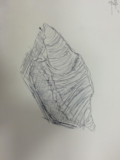
In Shell Paintings I like the colours and the different tones of the colours with the earthy tones and the different shades of blue. I like how she has shown the process of her doing the painting. I like how the painting of the shell looks almost like a digital painting with the use of gel mediums. I like the idea behind the painting showing an island scenery inside the shell instead of outside the shell where the shell comes from. I like the lines created from the different shades and tones of blue that show the ripples and waves of the water around the shell and how they follow the direction of the shells outline. This artists piece of work links to my chosen theme because it is a shell which is a natural form. This artist is different to the other artists because her work directly links in with my theme being literal paintings and drawings of shells. Her style is also different with the colours being quite realistic and the work style being quite surrealist with the painting of the island scenery inside the shell. I like the lighter tones that act like the light reflecting off of the water.
 |
| Windswept - Acrylic http://www.linzilynn.com/ |
In Windswept I like the bright, bold colours and the different tones of the colours that show the direction of the hairs and make the hair seem more realistic giving the impression of tiny strands grouped together. I like how the artist has taken a real thing and painted it using colours that make it not look realistic. This artists style using bright colours is similar to my observation studies of the shells using coloured chalk where I used bright colours that are not really associated or part of the shell. This relates to my theme because shells and crystals are colourful and this artists artwork focuses on colour so I could use this technique whilst doing crystals and shells to focus on the colour and to make it stand out more by using more colours on the shells/crystals.
 |
| Cool Daybreak - Acrylic http://www.klhansen.com/Karen_Hansen/Welcome.html |
Cool Daybreak is an abstract painting. I like the colour coding of this painting with the different blues with shades from almost pure white blue to dark blue. I like the texture of this painting, it looks quite rough and dotty, it would be good to recreate using a sponge to get the faded effect of the paint overlapping the different shades and tones of blue. This artists style is different to the others as her work is not a painting of a specific thing or object, it looks like an explosion of colours related to a specific thing and in this case it is daybreak. I could use this style and take colours from a specific shell or crystal and use the colours in this style or I could experiment with colours in this style and paint shells or crystals over the top and have this as the background. I like this style because you have more freedom with the strokes and what you paint. This links in to my starting point because it looks quite faded from overlaying the colours which I could use combined with my theme of natural forms to show that it is old and faded but it is also a natural form.


